I’m not quite sure where the time has gone. I think many of us have experienced an ‘unusual’ 18 months at best. However, today I woke up and finally wanted to do something with my website. So, taking the bull by the horns, so to speak, I’m getting on with it.
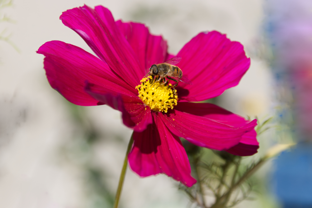
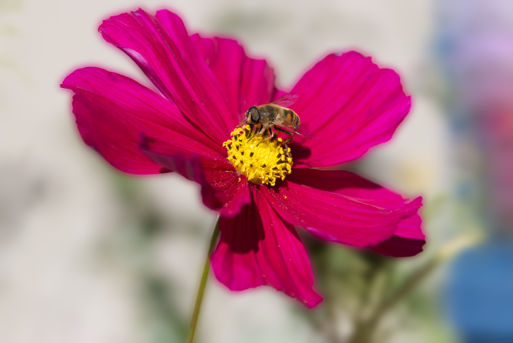
The image in question is below. It was taken in Black and White as a RAW file and I quite like it (I believe using the red filter in camera). But, I also like the vibrancy of the colour image. So what I’m proposing is a mixture of the two and see what looks best – if any!
As I’m completely rusty with my Affinity Photo skills, this will take longer than your average novice, as I have to teach myself how to do this first…
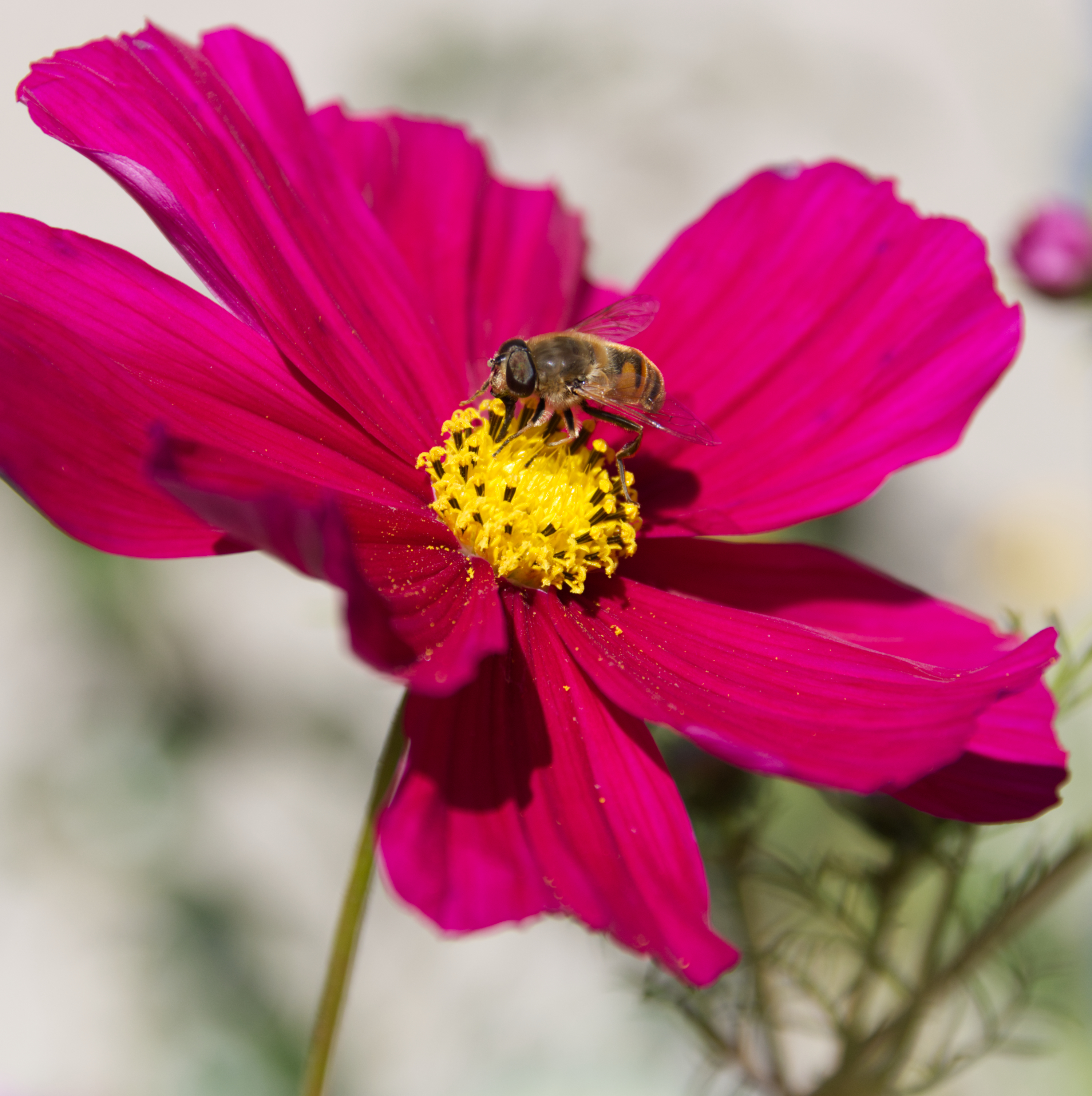
Colour 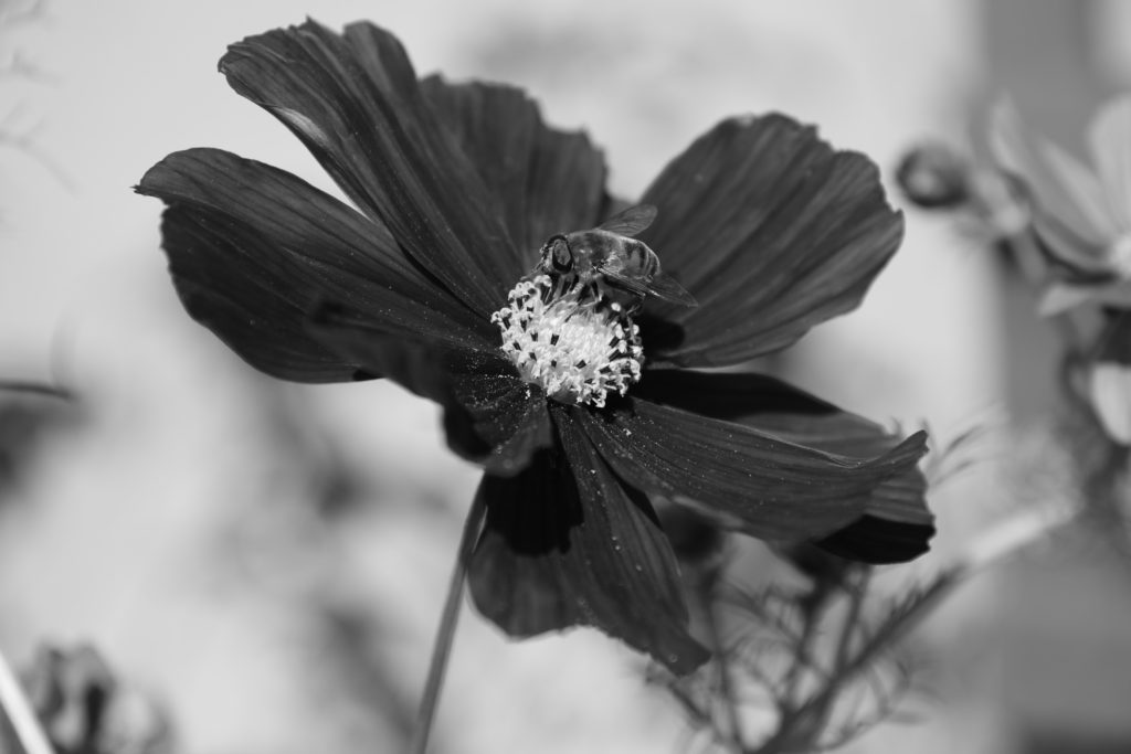
RAW B&W
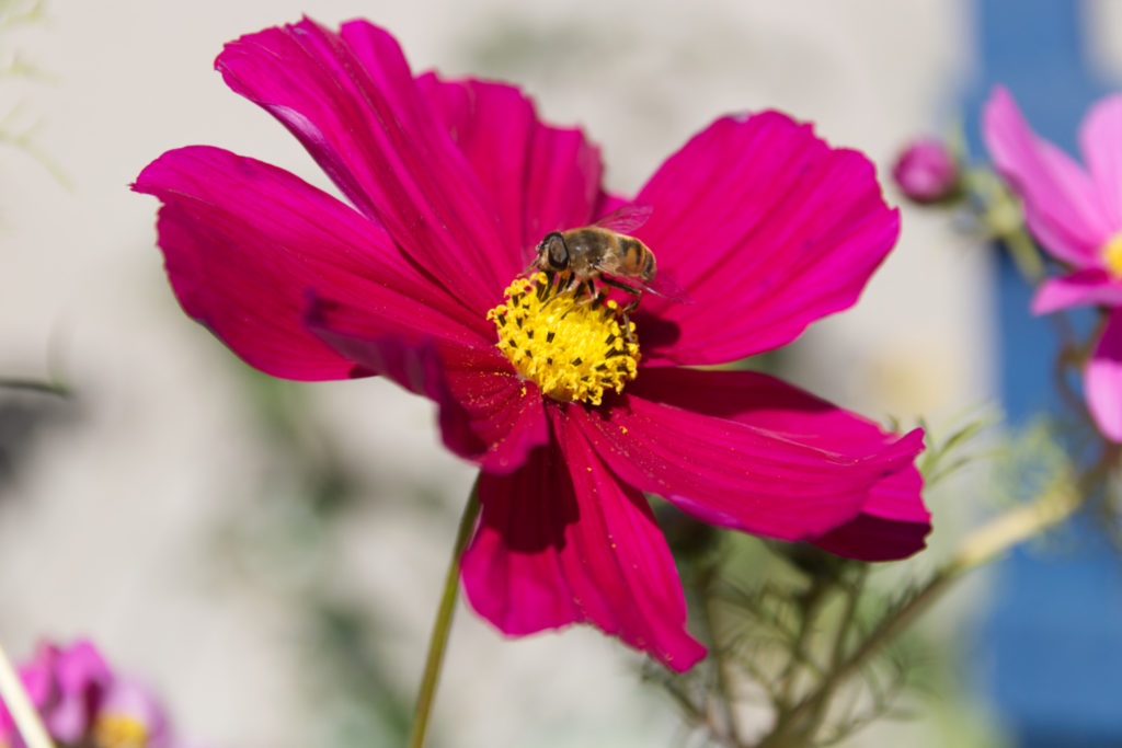
When loading the RAW image in Affinity Photo and you select the option to develop it, the colours are restored, as obviously RAW files retain all the colour data. However, as this was an image I had taken last year, I had forgotten about the surprise in the background. Have a look below at the streak of blue, which I thought distracted from the flower.
First up in my attempt to remove some background distraction was inpainting. This tool can be found in the brush icon and is called the inpainting brush tool. I attempted to remove the flower in the right hand side of the photo and the bottom left. That gave the result below. A bit dubious!
Next I turned to changing the image to black and white. I found a tutorial online (see link below). It’s the first one that popped up when I did a Google search.
https://affinityspotlight.com/article/create-black-and-white-colour-pop-photos-using-masking/
Then I applied a Gaussian Blur to the image. The chap in this video explained it really well (search for Affinity Revolution, Make Beautiful Blurred backgrounds in Affinity photo found on You Tube). It’s just a short 5 minute video but I’ve learnt so much already. In the process of blurring the background, you can choose the radius. I’ve put some examples below to show what I mean. As you can see, the higher the radius value chosen the more blurred the background. But what also happens, as I’m a novice, is that the edge of the flower has blurred too. I imagine this is something a bit of knowledge can fix.
47.9 px radius blur 
67 px radius blur 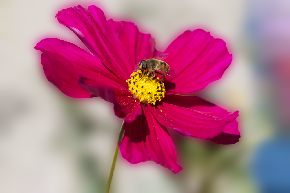
100 px radius blur
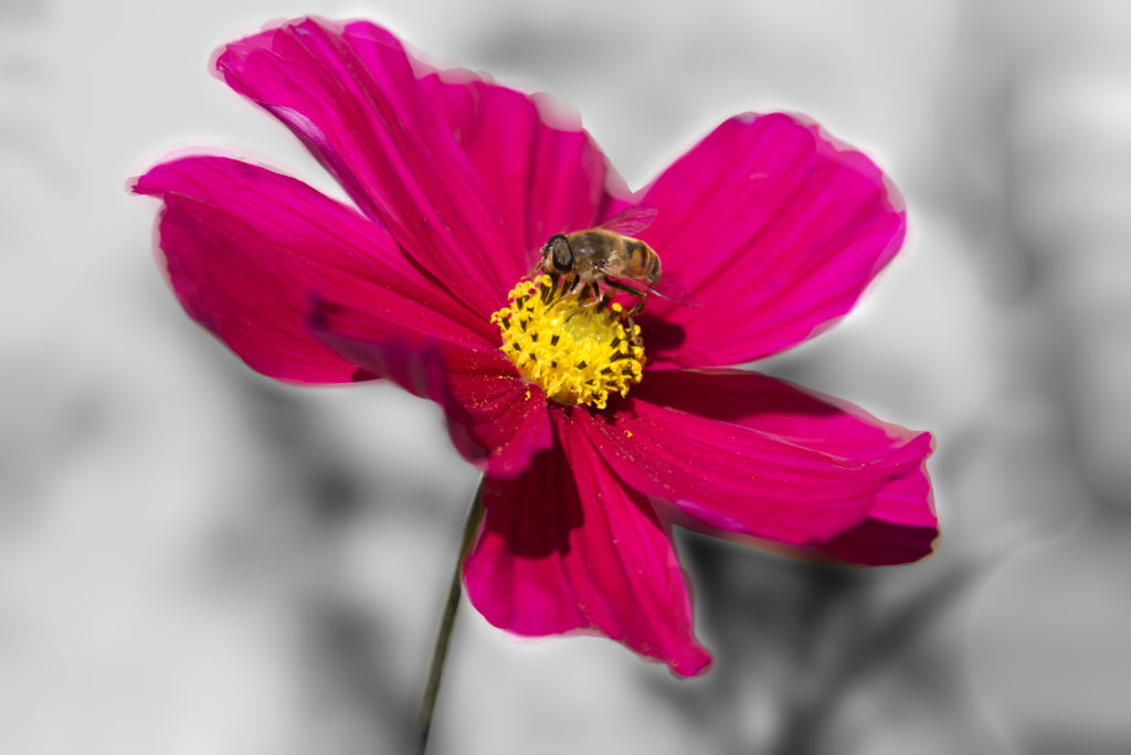
Then I attempted to change the background to black and white. This involved using a layer and adjusting the colours to create the tone of black and white I was looking for. Then, as explained in the article below, I used the erase brush tool to erase out the bits I didn’t want to be black and white. In this instance, I erased over the flower to reveal it’s true colours.
https://affinityspotlight.com/article/create-black-and-white-colour-pop-photos-using-masking/
It is in no ways perfect. I was looking for a crisper edge of the flower petals, but clearly there is much blurred hazing occuring. I have however, enjoyed finally having a go at doing things again.
If you have any dummy proof suggestions on how I can improve this image, please do let me know. Remember, be kind – I’m only a novice!